THE ELECTRICIAN was a challenge to ‘Brand The Boring’. What I attempted to do here was provide a slightly different character to the profession. What is implied from the name is that of a character, either in a play or graphic novel. ‘The Electrician’ has one obvious role to play, and that is to be ‘The Electrician’. The name suggests that the person is a professional, at the top of their game. The Name is trustworthy. It also implies that they are the best electrician, with the notion that all other technicians are sub-par. In terms of design I think that the brief when quite far for the two days I had allocated it, with a well refined and subtle logo shown to work on a range of applications I am pleased with both the design and theoretical choices I have made. If I were to push this further I would have liked to develop more of a cult image for the electrician, given the character some more lore and mystery, this could have been achieved by the production of a short graphic novel about The Electrician, acting as a piece of entertainment and promotional material for the brand.
Sadly, due to my poor planning and terrible memory I never submitted this work to Elmwood, having travelled home without the files, which I had left at Uni.

Saturday, 14 December 2013
Friday, 13 December 2013
Wednesday, 11 December 2013


NEWSPAPER// Evaluation
This has been a great brief, both in terms of the outcome and the way that we reached it. The design sprint was a huge help and I really do intend to use it again; hopefully in another collaboration because I really need the responsibility of ensuring that I am not letting anyone down to focus as much as I have done on this project. Most importantly the design sprints focus on research and development, before we could start designing for real, really ensured we had all the knowledge and tools ready to put together the whole thing in only a week. It has been a great benefit working with Martin as his planning and timekeeping is great, and we have similar interests in satire as well as the topics we covered in the paper and our views on them. This ensured that the Ubergine has very consistent humour, we could make decisions and come to agreement on how to move forward with problems easily and this was a huge bonus. For me, the most important thing this year is to produce work that I would be happy to place in a portfolio, work that looks good, but more importantly is based on my interests. This is a brief I can talk about and be excited to talk about as well as one that was inspiring to work on. Moving forward it would be great to source original content for a project like this and get a real Ubergine out there.
Tuesday, 10 December 2013
ELMWOOD// TheElectrician.com


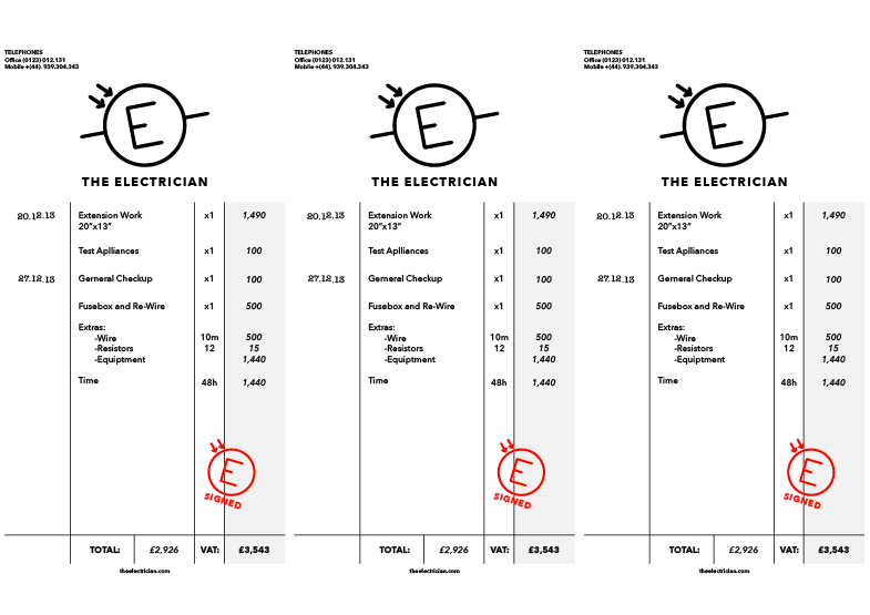
I plan on using these images to help present the brand in a clear and coherent way, to further the depth of this concept for Elmwood when they review the idea. I have followed the design aesthetic of the rest of this branding project, with red black and grey chosen to continue the comic book hero tone of voice.
ELMWOOD// The Electricians Tone of Voice.


Monday, 9 December 2013
ELMWOOD// Other Applied Branding


Sunday, 8 December 2013
ELMWOOD// The Electricians Business Cards


Wednesday, 4 December 2013
NEW UNION FLAG// Evaluation

This has been a very interesting brief and one that I would have never though of doing if it had not been set by TBM. What was particularly interesting was how hard the task was despite it seeming easy to begin with. There is a huge list of rules and standards that flags follow, on top of culture and national identity that dictates what a countries flag should look like. The difficult part was distilling those rules and making something that would actually work.
I think my proposal for the New Union Flag is just about as precise as I can get to designing something which reaches all of these criteria. The design is modern, but follows the traditional rules of flag design. It looks quite European, but the blue boarder gives it the distinction that a British flag should have... It is similar but not the same. Additionally, each bar from the framed tricolour represents one remaining country in the UK so for the first time all three are acknowledged equally in the national flag. Finally the flag is unique, no other world flag is configured with a tricolour placed in a border, however whilst it is unique it still looks very much like a national flag of a sovereign state becuase it used simple shapes and colours.
The only negative comment I have to point out about the flag is that it does look like the flag of a republic, not a constitutional monarchy like the UK. This is why so many flags in Europe use the Tricolour configuration, following the French revolutionary design. This is not a particularly large problem becuase this is not what the tricolour stands for in places like The Netherlands and Russia, which have both used it whilst under monarchial rule. For me the use of the tricolour was important because it steps away from using crosses. The UK has a secular society so this is a chance to design a secular national identity. In addition the British monarchy holds no real power today, in my opinion they shouldn’t be held in such high regard as to dictate the design of a new flag.
Overall this has been a successful brief. The final step is to get the flag printed at a large scale for presentation. TBM responded positively to the flag during the first crit. It would be great to know what they thought of the final design.
NEWSPAPER// Ubergine Photoshoot


Tuesday, 3 December 2013
ELMWOOD// The Electrician Pt2
Following my previous post the plan is to add some 'lore' to the concept of 'The Electrician'. The feeling I want to generate is one of a cult hero, good as his/ her job in everyday, to the point that they are slightly unusual as a result. The idea would be to generate the feeling that 'The Electrician' really cares about household electrics and has a real passion for doing a good job.
I have also slightly altered the logo to include the full name and to also create a more interesting icon for the circuitry element, tilting it slightly and adding the arrows to make it seem more like an actual icon, in this case the arrows are the reverse of a light emitting diode.


Although these aren't really good example of the sort of people you want in your house they are the best at what they do, cult movie characters with insane personalities...

.jpg)
Monday, 2 December 2013
ELMWOOD// The Electrician
The Electrician is an idea which spawned from the research on wiring charts and circuitry. The Aim was to illustrate 'The Electrician' in a way which appeals to the professions technical basis. A good wiring schematic is a true piece of graphic design, the communication of information in its most simple form, I want to use this style and develop a brand identity for 'The Electrician' based on these.
One thing that I noticed as the illustration developed was the find line between the detail needed to make it look like a wiring schematic and making the logo too detailed to be suitable. The perfect balance would be something which looks like a detailed diagram, but is also easily ingested for the reader, over-complication could look impressive, but will detract form the brands strength in the long run.
I have also included some preliminary ideas of how a logo could be taken from the body of the design, and how the overall identity could work in different weights, as an experiment...
 |
| First Batch |
 |
| Adding Components |
 |
| Working Identity |
 |
| 'Logo' |
ELMWOOD// Electrical Diagrams


.gif)


Subscribe to:
Posts (Atom)