Friday 28 February 2014

WPP// PE: Priority Pack

At the same time as photographing the poster we took a few shots of the Priority Pack in action.The aim here was to film the pack in action, with either myself or Simon pulling the books out of the pack, and opening one or all of them and placing them down on a neat pile. This was incredibly difficult to get right, especially as you had to hug the tripod to reach the books, which has caused most of our footage to be very shaky and therefore unusable. As a backup plan we also took a load of stills for the video which could be presented in a clear way accompanied by the voice-over. We may have to do this anyway because we have a time limit for the video of 2 mins and each shot of the pack in use took 30 seconds as a minimum. Still the stills came out great, with the exception of the dirty edges on the priority pack box due to the laser cutter....


WPP// Priority Earth Poster

These are the shots we got of the poster from our photo shoot. This was the first time I had used the college photo equipment so it was a great benefit to have Simon there who was a big help. From the poster what we need is the reaction of the thermo ink to heat captured on video for our video's introduction. We didn't get any decent shots of the full poster in this shoot unfortunately, we just didn't have a camera or the right equipment to get the whole thing in and take a good photo, so this will have to be done another time. Sating that we got loads of good video, almost too much for editing. These are some stills we took to get the shot right before filming...


Thursday 27 February 2014

WPP// Poster and Priority Pack Photoshoot

Earlier was our photo-shoot for the video, the main aim of the day was to capture footage for the video, mainly the posters thermochromic ink reacting to heat, provided by a hair-dryer. We wanted shots of the books being used with the Priority Pack box and some of them being opened and read. We still need to edit most of what we have captured today however I know we have some great shots of the thermo ink. Although most of the day was a success it was nearly impossible to get good footage of us using the books and their box with the equipment we were using. We needed a higher tripod really but we have a few back-up shots for plan-b which is to show the books as images in the video with a voice-over instead, which in reality is probably exactly how it will go down.


Monday 24 February 2014

WPP// Priority Earth Forum

To accompany the website we need to designate a space for our pledger's to go where they can share useful information and form an online community. This post is about the design for that space; the Priority: Earth forum, or more accurately, its homepage. The image above was a quick concept for the page however we have developed a very nice atheistic over the last few weeks that we should follow as much as possible, so this was scrapped quickly.

We used a very simple grid just to make sure everything on the page was proportioned well. We've kept the icons down the left hand side as a piece of identity and placed the Priority: Earth logo in what is said to be the first point of the page that people look at. We have also taken the colours from the Priority: Earth colour scheme for the log in button, but left the rest of the page completely colourless. This really gives the image and the log in section a very balanced appearance. We also added a sign up button to the to left, however anyone why pledges on the pledge system will already be a forum member.


WPP// Priority Earth Website

I've been doing a load of work on the website and with Simon's help we have come up with what should be our final design, ready to place into After effects to begin production of the video. This is an image of the final artboard and the following post will run though a few of the different pages on the single page site and what they do as you can see the site follows the four colour code of the four Pledges that users can make to the campaign. This is the central aim of the site, to accept the pledges, send out the Priority Pack and display data about what other pledger's are doing. As I have pointed out before this is the main aim, to get people to realised that they are not alone, and that there efforts are not totally in vain.

This is the landing page or the home page, where the familiar graphic of the halftone earth this displayed with the four pledge icons overlay. It also greets users to the site and summerises the aims of the campaign.

To the right of the page is a faint impression of the icons again, when we put this into after effects to develop the animation these will be accompanied by the priority earth logo and will be fixed to the page. Clicking here will return the user to the homepage. I have also included a simple scroll bar, this will be edited on a different layer with it comes to making the animation so that it moves independently from the page for a realistic effect.

This is the second page on the site, labelled Manifesto. Now this is not truly how the page will look in action as this is just a still image. In the animation and on the real site the Navigation bar will be fixed in position and follow the user down the page on the left hand side, which is empty in this image. The manifesto page simply reads off the manifesto of the campaign, colour coded to whichever pledge it is related too. We have also added these little headers as the users are navigated down the single page site to remind them where they are but also to introduce each new section. 

The next page 'pledge' is the largest and starts with an introduction to the pledge system, explaining what will happen when you pledge and what it means. This is an enlarged image of the page which follows...
This is the first half of the pledge page, once the readers have decided what they want to pledge towards they can...
... Sign up to Priority: Earth to receive a printed or web version of the Priority Pack and also enter their pledges into the world map database.
A close up image of the singing up page and some icons on the pledge page.

The next page is the 'Maps' page, this is where users can come and find out what other people have pledged to help with on a global scale. The aim of this page is to increase that sense of a global community working towards an actual outcome rather than a single hippie just trudging on against everyone else. In the animation we would also like to show off the other tabs on this page and display more information when you roll over specific regions.

The final page of the site is the 'About' sections which handles a post word and the contact information for the website.
As is customary at the very bottom of the page is a site-map for navigation back up the page, however remember that in the final edition of the site the nav bar will also be following the viewer  down the page also to the left.

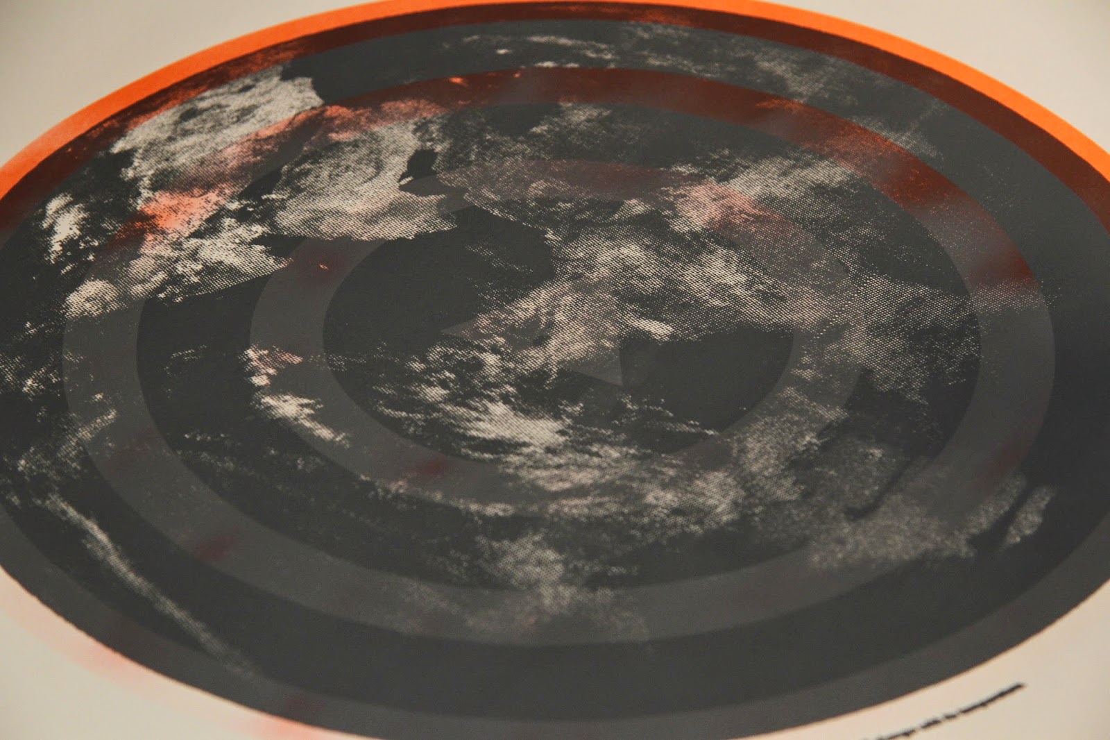
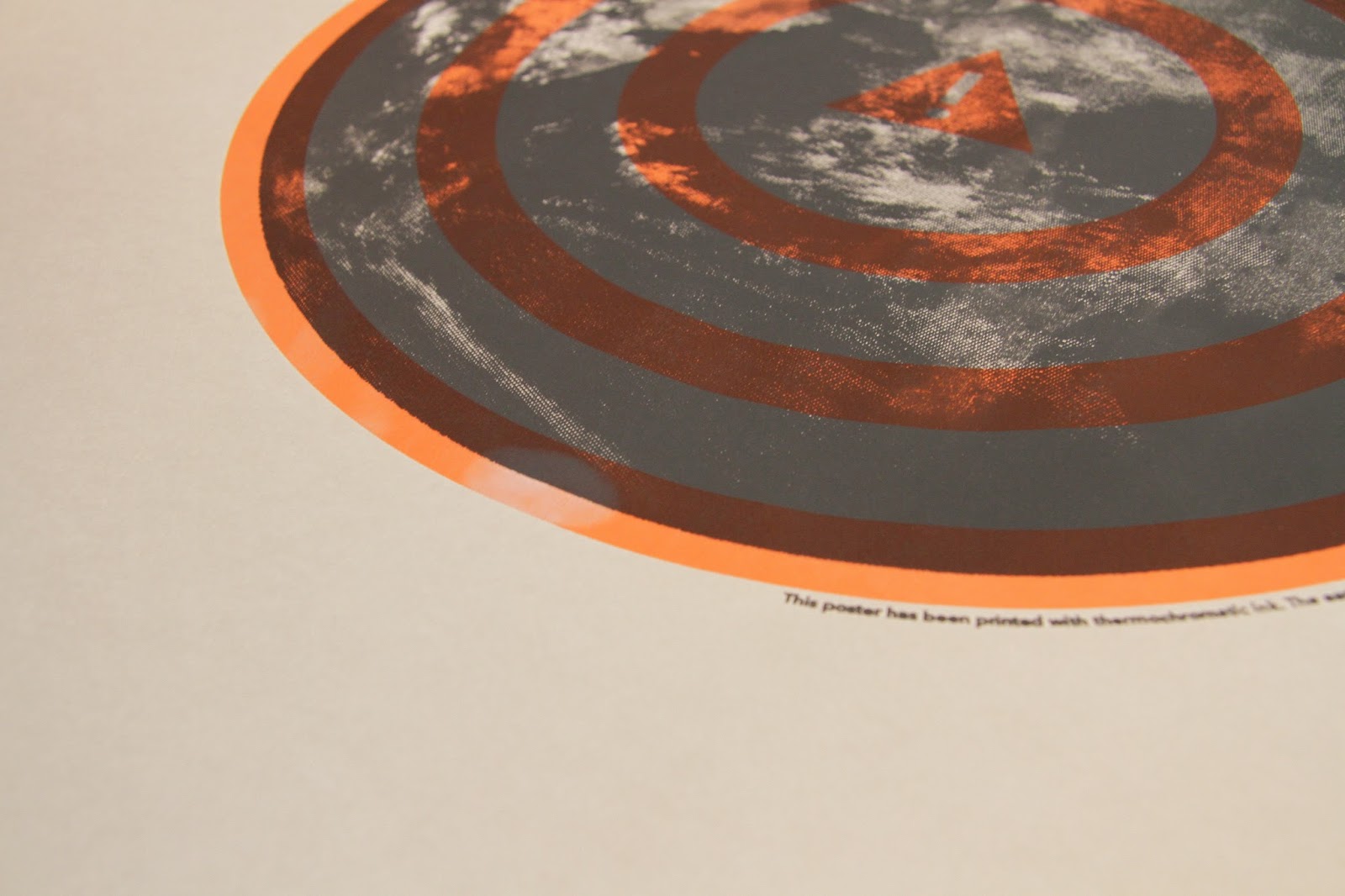
Before we settled on the four vertical pledge segments seen on the pledge page, (with the 'Sign' button at the bottom) we messed around with some other ways to sign up to pledges, this was one of the options where the user would select from a wheel which would be gradually coloured in as they selected more pledges. This version died for multiple reasons, firstly it couldn't fit all the information on the page, then it wasn't especially scalable. Its also not very clear that the user is actually signing up for anything and finally it doesn't really have a very satisfying check box system like the one we went for in the end.

Sunday 23 February 2014

WPP// Priority Pack Cover Design and Construction

This is our final design for the Priority Packs cover. We basically started again and used elements from the website and poster to produce this. The halftone image of the Earth is used as a background pattern here whilst a coloured circle uses the four colours of the four pledges you need to make to receive the pack.

This is the cover as it should look head on once printed, with the dark grey referencing where the thumb holes will be. In reality we have got rid of the central hole because it will reduce the durability of the box.
After printing the Box we went and lazer-cut the net according to our plan, surprisingly both our original and back-up prints came out absolutely fine.

We then folded and glued the boxes together the only problem we have encountered here is that the boxes edges have been burnt by the laser cutter. This was something we know would happen, but its worse than we anticipated so any high resolution photos may look dirty as a result.


We have also tested out our very simple belly band. We did plan on having a more detailed one and tested out a few with the logo printed across them however with detailing on them they distracted away from the books and the overall design was rather jarring. This is how the books will arrive once unpackaged if you pledge for less than four.