Tuesday 29 April 2014

TO THE MOON// Back Cover

The back cover of the publication is based on the back covers of Colors Magazine which often use this simple space as a post-word or summery of the contents of their work. This is the post-word, highlighting the bright future plans for manned space exploration into deep space in the near future. I have also used a stylised figure of eight slingshot motion icon illustrating the trajectory that spacecraft use to reach the moon and get back to earth.

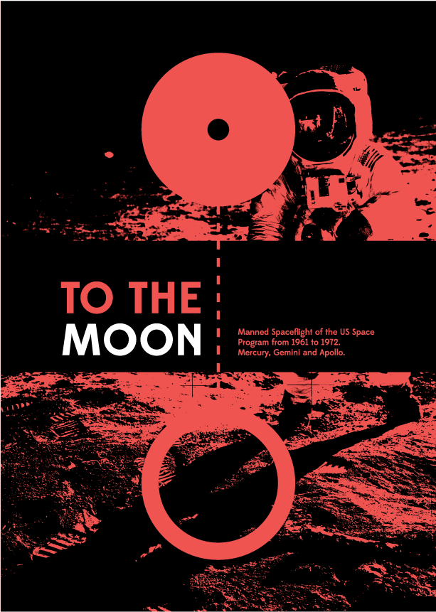
TO THE MOON// Cover Design 2

 I really didn't like much of the designs for the covers on the last books. One of the problems that I am experiencing is that the topic has a certain set of visual identities that are very difficult for me to escape from. Like the picture of the astronaut and the white on black cover. So what I have done here is start over with a different concept and an idea to have what I think would be the standard cover for a book like this and then work backwards, and be left with a more refined design.

The concept for this cover is to display the Earth and the Moon at a realistic scale and distance. Above and to the left is an example of this. I then thought about how I could fill all of that space and came up with a solution to use the negative space of two joined circles to illustrate their sizes. This is seen on the right and all other images on this page. The dotted line represents the two worlds being joined together by the missions for the first time.

 Here are some examples of the cover if I were going to use colour. I like these covers but they are a little too dark and kind of have this old 90s vibe about them that made me start again.

 To finish the covers I took them right back to the basics with just the diagram and the text, then added the photo in the image of the moon and earth. The final step for me was to create some more symmetry to square off the cover with some icons illustrating the rockets, spacecraft, astronauts and physics involved in reaching the Moon.

The design of the cover stylistically depicts the Earth and Moon connected by a tether, representing the main goal of the US space program during that era; to put a man on the moon. This is filled with the image of Armstrong standing on the surface of the Moon for the first time. Crossing this image is the publications title and a short subtitle detailing the contents of the publication. I have also added some icons to the cover to add some balance and symmetry to the design, and illustrating some of the contents of the book.


TO THE MOON// Cover Design 1

 I wanted to base the front cover of the Book on the physical journey to the Moon and back to Earth, which makes what could be an iconic figure of eight pattern. I am also interested in giving the cover a black boarder, which would allow for a black spine and back cover and would frame any images I use on the front cover nicely. 

 I also need to work out a way of describing the contents of the book without taking up too much space on the cover. It has to tell the reader that the book contains all of the manned space missions of the Mercury, Gemini and Apollo programs.
 I have also played with the idea of including a full image on the cover. I think that this could get peoples attention. However it does look a bit text-book-like when used so I may revert to a vector, Indy-magazine style cover.

 The last thing I have been looking at is this figure of eight shape, It could be used to illustrate the journey in a stylised way on the cover or in the book as a logo or identity.

Monday 28 April 2014

TO THE MOON// Building in InDesign

This post is all about the construction of the book in InDesign and the realisation of the layout.
The pages here will all be in order however only a few from each chapter will be shown as all pages follow the same grid. As a result the major time consumer here has been the writing of the publication. Most of the information for each mission I have sourced off of the NASA image database or the Wikipedia entry for each mission. This has depended on what I was writing about, NASA provided more of the hard facts about each mission and Wikipedia often links in with stories and side notes, some of which are quite interesting.

The grid I have used contains 10 columns, however I have planned to only use 9 as a rule leaving the ones closest to the spine free for the fold in the perfect bound document. This is true for everything except the image of each spacecraft, which runs into the fold like a full bleed image.

Above is the contents page for the whole book, which is split up into a the three chapters, one for each program devised for the Moon Race; Mercury, Gemini and Apollo. It is important to note that I have used official designations for each mission so the switching between Roman and Arabic numerals is intentional.

The start of each chapter has a cover sheet containing a list of all the missions, manned and unmanned what were undertaken by the particular program as well as the programs goals and outcomes.
 
 The first program 'Mercury' flew missions with only one pilot. I had to design this grid layout so that extra pilots could be added to the 'crew' section as the missions grew in size. I decided to go with a full page image on the right page and all other information on the left page for each spread.

I have also decided to add the missions patch to each spread. This is another element of the mission which can be used to distinguish it from others. The only downside of this is that they are all irregular shapes, thus it has been hard to maintain a solid grid and also included them all. 

 The other addition of the cover pages for each chapter is an official cutaway drawing for each spacecraft that flew the mission. Here is the Gemini capsule, a two man spacecraft. I have also introduced the Key Terms list to this section, explaining some terms that may be used in the text to make sure readers can understand what is going on.

The Gemini chapter of the book features two pilots per mission so the grid compensates for the extra information. Other than that everything moves on as normal.

 The only other minor thing that is altered is in the Mission panel, where a run-down of the mission parameters is detailed. Here the old tab 'Alt Name' is replaced with 'Callsign' as NASA cancelled alternative names for flights after Gemini 5.

The Apollo program chapter cover features the most detailed cutaway drawing of the Saturn V and Apollo vehicle produced. I included it because it is a testament to the complexity of the machine and also because of how interesting it is.The Apollo program had so many unmanned test missions that I had to alter the way that the list is presented here, which also allowed me to include a few more entries to the key terms section, which was a bonus.

 The Apollo pages contain three astronauts per mission so the grid has accommodated for the extra man by opening up the left two columns. It is important to note that the content further down the page is centralised and leaves a wide space open on the left. This is so the reader has a place to hold the publication and still be able to view everything without hands getting in the way. 

 Here is an example of an Apollo mission page without the grid. I have tried to pick a photo for each mission which summarises it in the most interesting way possible. For example here I have used an image of Apollo 10's lunar lander detaching from the command module. Apollo 10 never landed on the moon however this was the pivotal test of the mission, and a less well known photograph that I believe sums it up in the best visual way possible.

 After the entry for the Apollo 11 mission I break away from the format and include two extra images of the most impressive and famous space mission of all time. I have taken text from the plaque that was left on the moon and used it on the right page and a statement by a group of British scientists regarding the mission and placed it on the right page.

This is the final entry in the book, the Apollo 17 mission, the final manned mission to go beyond low earth orbit.

As a final page I include the final shot taken of the moon by the Apollo 17 crew as they flew back to earth. Again with a quote from the crew as they did so. 


Sunday 27 April 2014

PROPAGATION HOUSE// Website Images

 Here are some other shots of the website. Above is the Contact us section, with a working map.
 The PA Hire and festive organiser section.
 List of studio equipment
 Live Rooms Pages
and finally Engineer profiles.

I have gone into more detail about this website in some other posts. For now these are mainly mockups of the final size for display in print.

PROPAGATION HOUSE// Responsive Website

 To illustrate the responsive nature of the website I have created these mockups using actual screen-shots of the website. This shows the scaling and resizing in the best way possible for print.

Wednesday 23 April 2014

PROPAGATION HOUSE// Website Changes Made

 This post documents some of the changes I have been making to the website after I had sent my work off to Mark to look at. Above is the first change he requested, to make sure that all of the 'Facilities' tabs where the same size. I have accomplished this task by re-writing the description text so that they sit in a more balanced way on the page.


 The other change that I wanted to make myself after watching the Video was to alter the dark top bar, to liven up the site a little bit and give the page that most will land on more impact. Below is the original version that I have been working with so far.

This version perhaps goes too far the other way, the intention of this was to see how far I could push the design of the top bar. This is far enough.

This version is subtly different from the first, incorporating a slight gradient to the image, resulting in a big difference to the feel of the front page. This version also contains a logo with glowing edges. I wanted to test if the would look good with a lighting effect. I dont think that it does so this version is going to be scrapped.

This is the final version of the front page. The slight gradient is included with the addition of the original logo design. This gives a good balance of colour and tone to the front page without being overbearing, sitting nicely between the text and the nav bar.

Tuesday 22 April 2014

TO THE MOON// Planing the Publication

 From all of the research I have done now it didn't really take any time at all to come up with a layout for this publication. I did sketch out a few ideas before moving on to a final plan. Most of these earlier idea are based on the books I had been reading and researching and have posted about before.

Having  collected the images and data my plan is to find solutions of how I could fit this on a page. I have decided that each double page spread should contain; one high res image taken during the mission, one image of the spacecraft used, the missions patch, a summery of the missions time and parameters, images and info on each astronaut who flew and finally a paragraph summerising the mission itself.

Here are some sketches of the different ways I planned on arranging this information with the final plan in the middle and grid on the right. Some things that I thought about but have not included in the final design are;
- A puttout sheet full of astronaut profiles, so that each one does not have to be on a page.
- An illustrated diagram of each ship.
- Book which opens to a portrait format along the top spine.


Monday 21 April 2014

TO THE MOON// Mission Image Collection

 The final set on images that I needed to collect was one main image for each section of the publication. These Images will be take a whole page and will try to summarise a key point for every mission. The are also the largest images I have had to find so I used the NASA image database again at http://spaceflight.nasa.gov/gallery/index.html.

The idea here is to print these opposite a description of the mission they are associated with to really drive the impact of the story in a visual way.