Thursday 20 March 2014

PROPAGATION HOUSE// Identity Applied

Just to provide a way to test the new Propagation House logo in context I have used these images to mock up some business cards, letters and lastly a solid piece of wood, which I will explain in a bit.

The business cards have come out well. One problem I thought that the logo could face would be that it would not scale down very well due to its large size and intricate detail. This hasn't really been a problem in the end as it is still a visually strong design at a small size. In addition it looks great as a large scale label on a range of products. This is the first hand drawn logo I have ever made and I am very happy with the outcome.

I mocked up the wooden laser cut piece of wood as an example for Mark. One of his studios has a totally wooden interior and is often featured in photographs of the studio published online and print. If I could laser-cut the new identity onto a slab of wood it could be placed in these photographs, thus growing the brand. 


Monday 17 March 2014

WPP// First Sub Boards

These are the submission boards we sent off in the end. They aren't exactly my favourite layout ever, but we were limited to only four images and this was such a big project that we really had to squeeze things in at this point. We used a 1920x1080 size because we know that they will be viewed on screen so that's why they are an unusual dimension for sub boards.  I have also added some of my own presentation boards for the website to the bottom of the post, which are basically just shots of each page of the size and a few from the video. Enjoy!


Saturday 15 March 2014

WPP// Campaign Overview and Manifesto

Priority: Earth is a new concept for a global campaign. Our central aim is to provide a positive space for those who already believe that climate change is a threat, and to activate a social and political movement with a strong community. The core of the Priority: Earth campaign would be found online at PriorityEarth.com, however we propose that a large scale print advertisement campaign point users towards the website. The posters have been developed with thermochromatic ink, which reacts to heat, altering their appearance. As a result the posters create a strong symbolic visual representation of global warming.

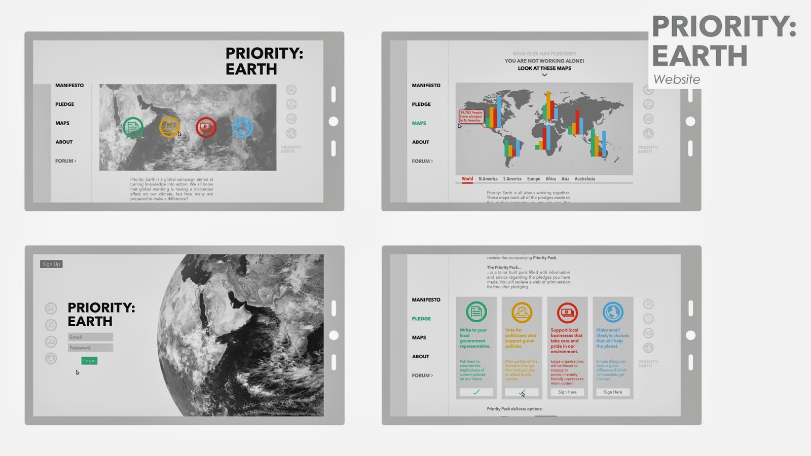
When users visit PriorityEarth.com they will be able to read our manifesto:

1. To put a price on carbon in the economy, and a price on denial in government.

2. To support green policies in politics.

3. To raise the global awareness of climate change.

4. To advance climate change education in schools.

5. To advocate the development of energy efficient technology.

6. To promote environmentally friendly and cost saving practice in business.

7. To provide a healthy environment for future generations.

8. To turn our knowledge into action. The only time to act is now.

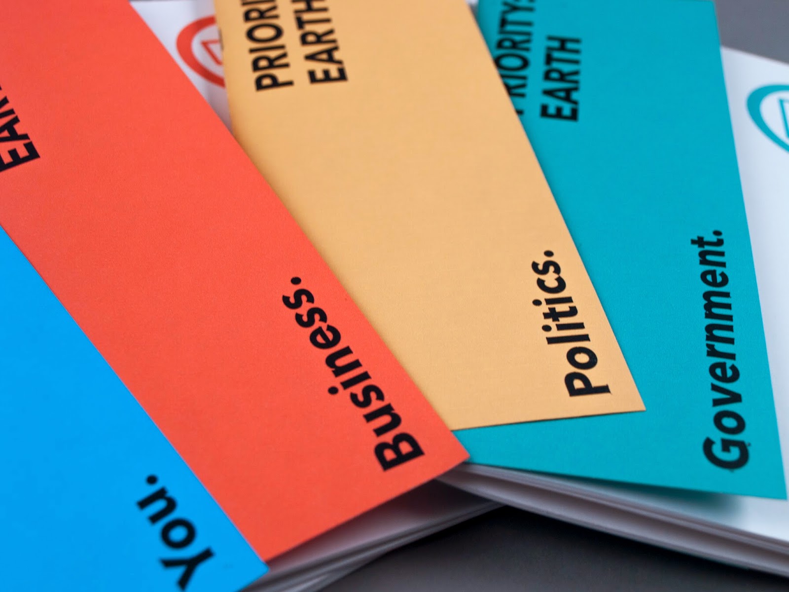
Having read the manifesto the user will be introduced to the ‘Pledge’ system, were the manifesto is organised into four key areas for action.

1. Government. Write to your local government representative, telling them to consider the implications of current policies on our future.

2. Politics. Vote for politicians who support green policies. Main parties will be forced to change their own policies to reflect public opinion.

3. Business. Support local businesses that take care and pride in the environment. Large organisations will be forced to engage in environmentally friendly practices to retain custom.

4. You. Make small lifestyle choices that will help the planet. Simple things like recycling and saving water can make a great difference if whole communities get involved.

Users can ‘Pledge’ to help in any -or all- of these four key areas, they will receive a ’Priority Pack’ based on their choice; a series of online or printed books filled with helpful information on how to get started.

The users pledge choice will also be added to data maps which can be viewed by anyone to see activity on a global scale. The aim of these maps is to provide support to the pessimist in all of us, who may believe that they are fighting climate change alone.

Finally the website supports a forum for anyone who pledges, to form a strong and helpful online community, share tips and organise activities.

For our submission we can send one a4 document supporting our work to help explain our campaign, we have put together this for submission:


Friday 14 March 2014

WPP// Second Photoshoot

So the first photo-shoot was set up to capture video and although we got a few still shots not of them were really that good. So Sam Lanes yearbook shoot came around so we set up this as an opportunity to take some better shots. This time we put emphasis on getting some good stills and some full shots of the poster most importantly. In my opinion these photos came out a million times better, I also used auto-focus so the images look much crisper too.


Thursday 13 March 2014

LEEDS TYPE// Proof of Concept Day

For a new collaboration with Mikey we have been testing a new idea around Leeds. The idea would be to exhibit the everyday typography used around the city. The final outcome could be a printed or digital map of the city presenting the locations where we have found interesting typography which summarises the 'feel' of its location, for example the university could be represented by its serif sign-age displaying its heritage. Hyde park could be represented by the large numbers painted on its wheelie bins and so on. Accompanying the map would be a magazine or book detailing the type and colours found in each area spotted from the map.

The idea as it stands seems quite abstract, more of an art project, however I think we are both happy with this, having lived in the city for some time it will be an interesting practice to go out and document our surroundings. The final outcome will be a piece of artwork and design with an understanding of the city and typography.

The photos here are a few we took to prove the viability of this concept, to see how the outcome could look and to make any changes to our plans before we go out an do some major image collection. Alongside the type we have a few images of patterns. The plan would be to display these alongside the type to generate a more accurate impression of location within the book.

Having collected some examples here are some concepts of how the book could look, with the type and image overlay. We are also considering adding a single colour to the page as to again ad a sense of 'location' or culture that may be found in each area.


Tuesday 11 March 2014

WPP// Cityscapes for Presentation Boards

Instead of presenting the posters in crappy photoshopped images or hung up around the college I decided to make these cityscapes to display the designs in. I think this will be a much clearer way of presenting the designs in context, and its something Fred told us to do three years ago. Here in order I have a Tube Escalator poster display, a Times Square-esque billboard, the famous LA building that has the massive tri-posters on it all the time, a simple tram stop image and finally a US city/ roadside billboard.


DIALOGUE// Evaluation

The two artworks I have created will be submitted to the  Dialogue exhibition and if one is picked to be printed it will be paired off with another submission by another designer or artist. The two artworks will then be layered and screenprinted in a range of colours by Eve Warren and Nathan Bolton.

As a test to see how my work would come out if selected, I mocked up this image of my two submissions. If I have the time it would be great to print this myself in the future, I feel it gives a very short snapshot of how I am reacting to the news and the state of the world as I understand it at this moment. In fact it would be a fascinating personal project to do one a year and see how my tastes and outlook change over time.

I think the final outcomes are perfect for what the exhibition is all about; asking questions and making statements that could be interpreted in a range of ways, ultimately striking up dialogue with the viewers. The submissions are also a good mix of social and political commentary, topics I was eager to complete at least one brief on this year. In terms of design they are fairly simple, however I find that they are entertaining to look at and try to interpret, most importantly, they actually communicate ideas of my own rather than being simple patterns and colours.