Saturday 30 November 2013

NEW UNION FLAG// TBM Submission

 These are the boards which are submitted to TBM. As well as showing off the new flag they explore the reasoning behind all designs....

The New Union Flag is a conceptual idea which has arisen from the distinct possibility of Scotland gaining independence in the 2014 referendum. The exercise is to establish what visual elements a New Union Flag would hold as well as its possible meanings and interpretations. My own design is visually revolutionary however the concept itself a simple evolution of the current Union Flag of the UK.

The Three horizontal bars running trough the centre of the flag are taken from the three colours which make the national flags of the remaining states within the UK; Red, Green and White. The Blue boarder represents the Ocean, signifying its importance in the history of the country as well as its physical nature; surrounding the British Isles and keeping us together.

Red from the St George Cross, Welsh Dragon, Northern Irish St Patrick’s Saltire. Hardiness, Resolution and Valour.

Green from the Welsh Flag. Earth, Agriculture and our Countryside.

White, the background of all three national flags. Peace, Purity and Truth.

Blue representing the Oceans that surround the British Isles and keep us together. Freedom, Justice and Prosperity.

 The New Union Flag is a simplistic interpretation of a set of morals, geographical attributes and independent national identities. I believe that this allows the flag to retain a level of nationalism; it should not appear to be too foreign to nationals because the concept involves the mixture of the member states national flags. Its simplistic design also allows the tone of the flag to remain fairly natural. The new flag has less ties to Empire, no religious symbolism and displays no affinity towards the Monarchy. It is a flag which offers a new identity on the surface, but still retains a core concept focused on history and our national identities.

Historically the primary function of a flag is to denote sides on the battlefield. By containing only four equally balanced colours the New Union Flag is easily recognisable. Although the three central colours are used by a number of different countries the addition of a solid blue border sets the flag apart visually. The concept of the blue boarder representing the ocean also speaks of our historically strong military past where the royal navy projected infantrymen to every corner of the globe.

Another application of theNew Union Flag is to represent the population of the UK. In many ways this will be the most sensitive area of transition from old to new as there is a huge emotional investment in our identity post-2012 Olympics. The advantage is the regional flags of England, Wales and Northern Ireland will remain the same, and the New Union Flag is still an amalgamation of the three, so the flag is still a celebration of unity.

As with any visual identity the form has to be recognisable at any scale. Because of the flags simple proportions it does not begin to look awkward at a large scale. At the same time and due to the same characteristics the flag does not loose readability at a small scale.

Here are the few examples of how various flags developed. Many of these ideas were refined into the final design. They display some interesting ideas I would have liked to have included in the final design, Including:

- Illustrating the Greenwich Meridian, which practically puts us at the centre of all world maps.
- Use of the Commonwealth star and various Northern constellations.
- A US style of counting districts and regions within the nation.
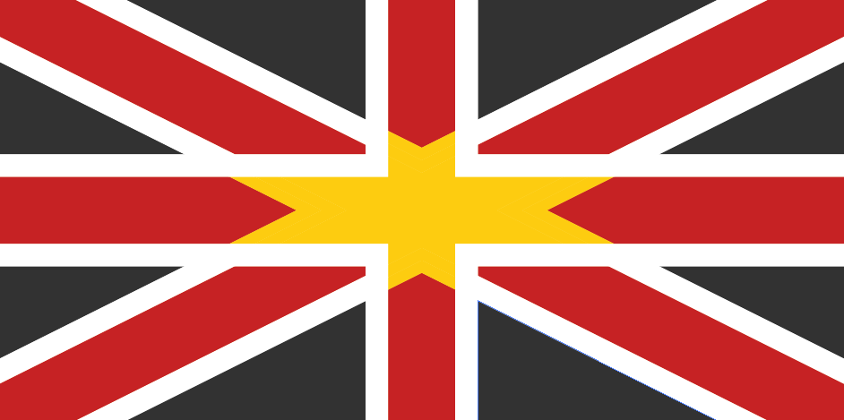
- A logical evolution which involves the black and gold welsh flag of St David replacing the Scottish flag.
-Combining the colours of all remaining nations within the UK and its crown dependencies and overseas territories.

Wednesday 27 November 2013

NEW UNION FLAG// The Union Flag Today


I am looking at the placement of the Union Flag in spaces and as a cultural, political, historical and military identifier of the United Kingdom. The union flag is great, it has a really strong identity and is completely unique in design. Its historical significance is massive and as a result it carries a lot of power. On the other end of the scale it carries a lot of baggage, its used by the nationalist far-right, on cheap souvenirs and super tacky photoshop jobs. A lot of what makes the flag look good or bad comes in the context it is placed in. For my flag to work it needs to look like it belongs in these sort of places, sports events, in the military and national monuments. 


A search for 'British Flag', 'The UK' and 'British Landmarks' to get the vibe of how others see our flag and the country if they search for it. 


Friday 22 November 2013

NEWSPAPER// The Ubergine Final Edition

This is our final edition of the Ubergine. Its been a very fast few weeks and we still have a few more things to do but the final product is here so we can relax a bit for now. The plan for the next few days is to get the paper printed, print and cut the post sleeve and then photograph everything.  

Wednesday 20 November 2013

NEW UNION FLAG// 5 Flags

Today I have picked a 'top5' flags from the many which I have created for the union flag redesign project. Some have various aspects in common but the idea here is to have a general overview of where I am at the moment and my thoughts on the flags so far. 


NEW UNION FLAG// Northern Hemisphere Constellations

Another idea which I have borrowed from a number of flags designed for the southern hemisphere is to include a star constellation. There are many flags from Oceania and A few from South America which use this as a visual representation of international status and modernity. These flags use the southern cross or 'Crux' which appears most recognisably on the Australian Flag:


The five stars on the right display the Crux, the star which appears under the Union Flag is the commonwealth star, denoting Australia's links to the commonwealth of nations.

Obviously I cant use the southern flag for a country which is located in the northern hemisphere. Here the most suitable constellation, with a reasonable number of stars and which also appears in our sky all year is Cassiopeia or 'The Queen'. The lore of The Queen is also suitable, in greek mythology Cassiopeia was a boasting queen who was punished for her assumption of superiority.
I put together this basic illustration to explain how I have laid out my version of Cassiopeia:


This constellation benefits from being a relatively small one. Meaning that the stars appear nice and large on the space provided, also being more recognisable and easier to remember. I did draw up plans for two other suitable constellations however these were too large and unwieldy to really fit on a flag intended to work at many different sizes.


NEWSPAPER// Other Content

In addition to all the text that is going into the paper we are also putting together a few images. They should follow the satirical style of the newspaper and provide references to the articles. We are sharing the workload on this task in the design department however we are checking with each-other to see if what we are making is appropriate for the paper. The design we are putting together mostly satartis the colunms, ads and pieces you find in modern british mewspapers, I have put together four....

The crime map. Based in a Daily Mail-esque fear mongering image of crime in England taking the shape of a knife when the dots are joined up. Although I'm not sure, I feel that this has been inspired by Brasseye, especially with the helpful key note labelling CRIME.


The second is a satirical job ad, looking for people to work of the NSA. It looks pretty poor but I think that adds to the overall aesthetic of the page that it will sit on and continues to poke fun at the organisation to be so.

The third is an add for a pyramid scheme called Chichen Itza finance. It makes fun of people being reckless with their own money as well as other peoples. This ad stretches down a full page so is probably the largest in the paper. It has made it rather interesting to design and come up with, especially with its unusual dimensions.  


The forth is an Ubergine special report found on the Celebrity page called 'WTF are they eating?'. Today they are eating the peel diet, based on eating lots of different peels. This was my favourite out of the lot, probably because it is the least serious so it doesn't sound as preachy. Also it is easier to make fun of celebrities. 


Tuesday 19 November 2013

NEW UNION FLAG// Ideas So Far

Here are some more developments of the Flag brief, A selection of the ideas I am pushing forwards with at the moment. I particularly like the very simple tricolour with a blue border. It is simple but effective as a flag and contains all colours of the remaining nations, surrounded by blue to represent the oceans. One thing that I am stuck on this this idea is the order in which to place the tricolour colours...
The top two are labelled as being the Omani and Hungarian flags, in addition the order white green and red from top to bottom makes the Bulgarian flag. I will most likely move forward with the bottom right image here, as red is the first colour on the English, Welsh and N.Irish flags with white being the background in all three, Leaving green to sit in the middle.

Here are some other ideas which have been canned. The globe design which marked the British isles geographical location was way to unusual to be the flag of a European country. On the right had side you can see the development of my favourite design so far, with all of the colours of the remaining nations flags, including the St Davids cross of Wales, merging together to for the final version.

NEWSPAPER// Packaging Prototype

Following the printing of our paper we have continued to work on this project at a reduced capacity. The plan going forward is to turn this interesting idea and product into a polished portfolio piece. To kick this off we have been thinking about how the paper will be delivered to subscribers and how it will appear in the shops. For the purpose of postage and delivery we aim to produce a mailing card that will protect the paper as a shell, frame the front page and identity and to finally provide a space for the postage address. The process started with a consultation of our ideas sheets from two weeks ago and a very rough mock up. We then continued be developing this idea in illustrator and printing some prototype versions followed by a simple colour version.
It is undecided wether we should laser cut the 'U' shape from the front of the pack or simple print it. In addition we have used the Ubergine colour to strengthen the brand identity and add some colour to the products presentation. I have also added some of the illustrations from the cover into the back of the design with the hope that this will provide some extra aesthetic appeal to the mostly functional design.
The aim in the next few days is to print this properly and photoshoot it with the final addition of the paper.

Crude Mock Up
In Illustrator
Front Cover in pack
Closeup front
Reverse with subscription stamp
Removing paper from pack

Sunday 17 November 2013

NEW UNION FLAG// Evolutionary Idea 1 Pt.2

I have continued with the Development of this Welsh/ N.Irish/ English Union Flag. The final image here is the design I will take forward with the others for submission to TBM. I've partly fixed the issue of having two crosses by using the diagonal cross to cut out the St David's cross, and use it as a yellow star in the centre of the design. This allows the St David to be in the flag while still keeping the rough shape of the existing flag. My only problem with this flag is that it is made up entirely from religious symbols. If we really want to have a new Union Flag it would be great to start fresh with a more secular design...


Saturday 16 November 2013

NEW UNION FLAG// Evolutionary Idea 1

My first evolutionary idea consists of simply taking the blue out of the current Union Flag. I believe this will be the most submitted design however so I have attempted to go a step further and include the Welsh flag of St David, a black and yellow flag into this design. Some of the outcomes are fairly interesting and I will look to develop this further.

I do however think that the flag could start to look quite soviet, with the use of red and yellow together. 


Friday 15 November 2013

NEW UNION FLAG// Revolutionary Idea 1

My first idea is all based around the Greenwich Mean Time, which places our country at the centre of most world maps. In most of these images I am trying to use a globe shape to illustrate the Earth and a line or dot to represent the UK.

One other idea shown here is a kind of US style flag where each county is of England, Wales and Northern Island is represented by a dot. The seven sided star of the commonwealth is also used and three larger dots representing the country as a whole.