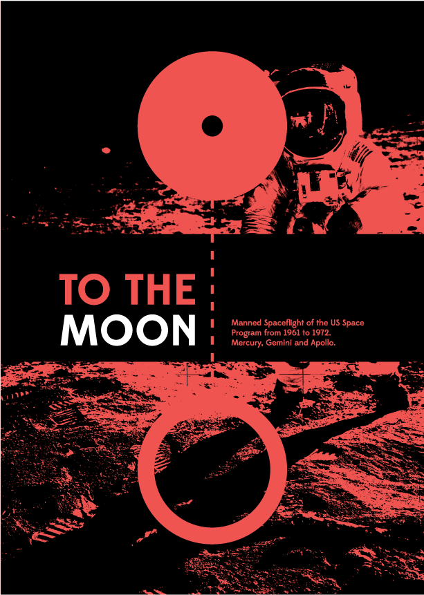
I really didn't like much of the designs for the covers on the last books. One of the problems that I am experiencing is that the topic has a certain set of visual identities that are very difficult for me to escape from. Like the picture of the astronaut and the white on black cover. So what I have done here is start over with a different concept and an idea to have what I think would be the standard cover for a book like this and then work backwards, and be left with a more refined design.
The concept for this cover is to display the Earth and the Moon at a realistic scale and distance. Above and to the left is an example of this. I then thought about how I could fill all of that space and came up with a solution to use the negative space of two joined circles to illustrate their sizes. This is seen on the right and all other images on this page. The dotted line represents the two worlds being joined together by the missions for the first time.
Here are some examples of the cover if I were going to use colour. I like these covers but they are a little too dark and kind of have this old 90s vibe about them that made me start again.
To finish the covers I took them right back to the basics with just the diagram and the text, then added the photo in the image of the moon and earth. The final step for me was to create some more symmetry to square off the cover with some icons illustrating the rockets, spacecraft, astronauts and physics involved in reaching the Moon.
The design of the cover stylistically depicts the Earth and Moon connected by a tether, representing the main goal of the US space program during that era; to put a man on the moon. This is filled with the image of Armstrong standing on the surface of the Moon for the first time. Crossing this image is the publications title and a short subtitle detailing the contents of the publication. I have also added some icons to the cover to add some balance and symmetry to the design, and illustrating some of the contents of the book.


No comments:
Post a Comment