This post will walk through some of the other pages on the website and go into a bit of detail about the various functions that the website has. Here I start with the four 'Facilities' pages that I was discussing in my previous post. These pages are all found by selecting an image on the home page. They are all introduced with a semi-fixed position background image with an inlay title. This is then pushed up as the user scrolls down the page for content. I have followed a two column grid here with a casual rule of placing text on the left and an image on the right. As a side note above you can see webflows navigation system on the left and its menu on the right. This allows for the user to add, edit and move items and functions about a number of pages.
This is the Live Rooms page, note that the image in the top right of the conent is a replication of the image on the control room page. This is an error on my part involving tags in the webflows options bar.
This is the Equipment page. This page is a very messy list on the current website so I have turned it into a two column list here. The green bars are just part of the webflow software showing where the padding is around each column.
Again here the padding 'xray' is turned on so all images default to grey. This is the accommodation page, explaining the studios location and surroundings, as well as some of the places that clients can stay while they are working.
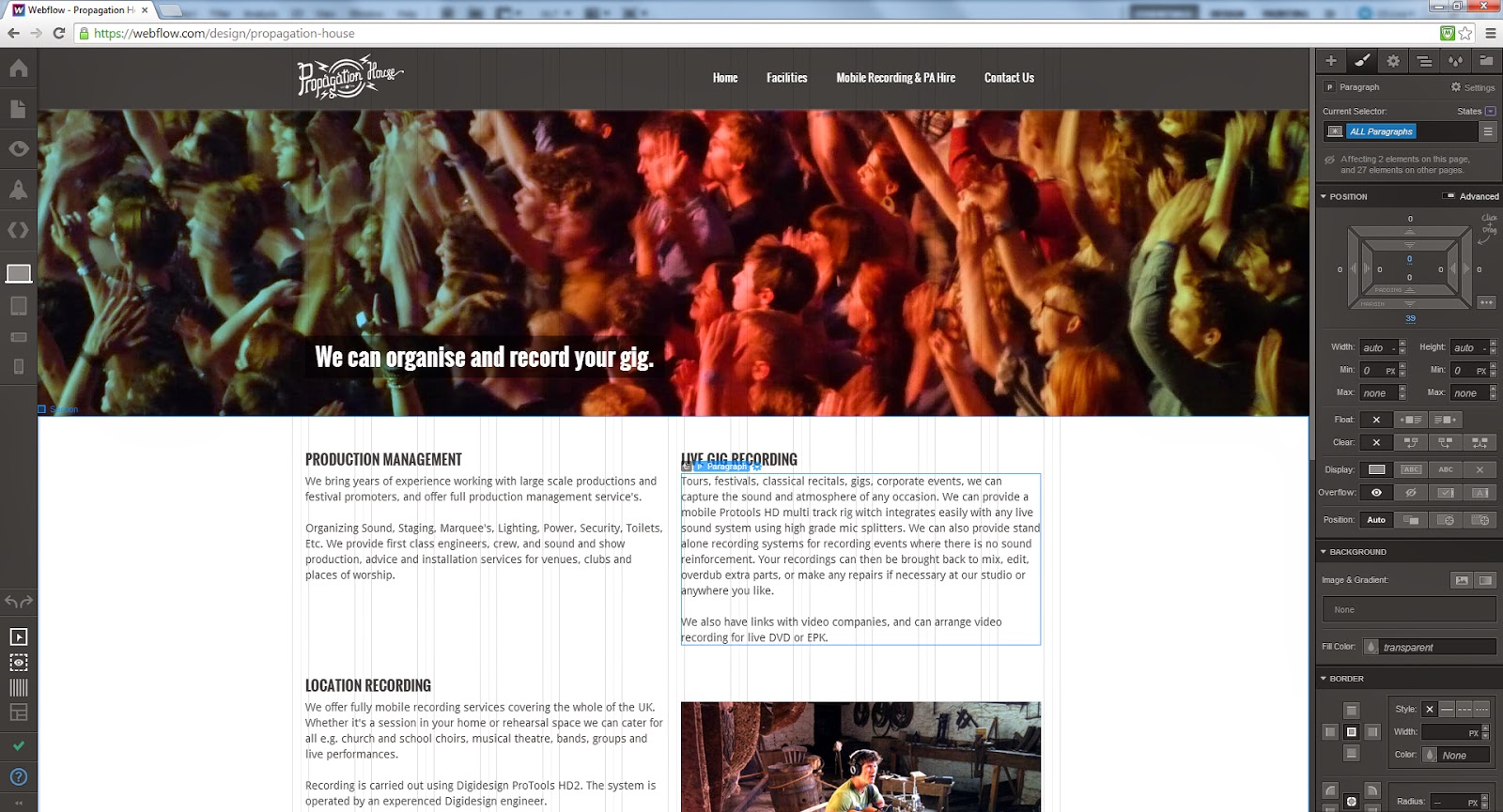
I have reconfigured the existing Propagation house website and named a new section 'Mobile Recording and PA Hire'. This page is all about the flexibility of the studio to offer mobile recording opportunities as well as PA Hire and festival set-ups.
Again at the bottom of this page is another Contact Us section. This allows users to see the contact us section on multiple pages, hopefully making it more likely for them to get in touch with the studio.
One aspect of the website that I am particularly proud of is that it is fully responsive to changes in the screen size, offering the maximum amount of viewability on a variety of screen sizes. Here is the site on an Ipad screen, note the responsive nature of the text and top image resizing.
Here is the page in iPhone format. At this size the Menu bar turns into a series of buttons and the paragraph sizes reshuffle to allow more text to fit the page. Images decrease in size.
One final note about the website at this stage is the Nav Bar. In this view the user is back on the home page. This is how the Nav Bar tabs light up when they are tolled over.
Now that the website is finished I will present it to Mark. I anticipate that a few of the images will have to be changed in the near future as the studio is currently under major refurbishment however all of the functionality and layout of the site has been finished.


No comments:
Post a Comment